

At Art Pharmacy, we champion colourful public art as a catalyst for ecological connection and placemaking.
We embed vibrant, site-responsive colour into public environments not just to delight the senses but to deepen engagement with place and foster environmental empathy. Colour in public space becomes more than visual. It becomes immersive, a moment of reconnection between people and the world around them.
Chromophobia in Public Space
The concept of chromophobia (Batchelor, 2000) offers a useful lens to understand why colour is often stripped from our shared environments. Batchelor argues that Western societies tend to “diminish [colour’s] significance and deny its complexity” (2000:22), relegating it to the superficial and artificial. This rejection of colour reveals a deeper cultural discomfort, one that reflects a broader disconnection from the vibrant natural world we evolved within.
We see this play out in our public spaces: monochrome palettes, sterile minimalism, and a recurring reliance on desaturated tones. White, long upheld as “the only true purifying colour” (Eliasson, 2006:76), dominates architecture and design, flattening perception and muting emotional response. In this context, colour acts as resistance; a tool for awakening, expression, and sensory repair.


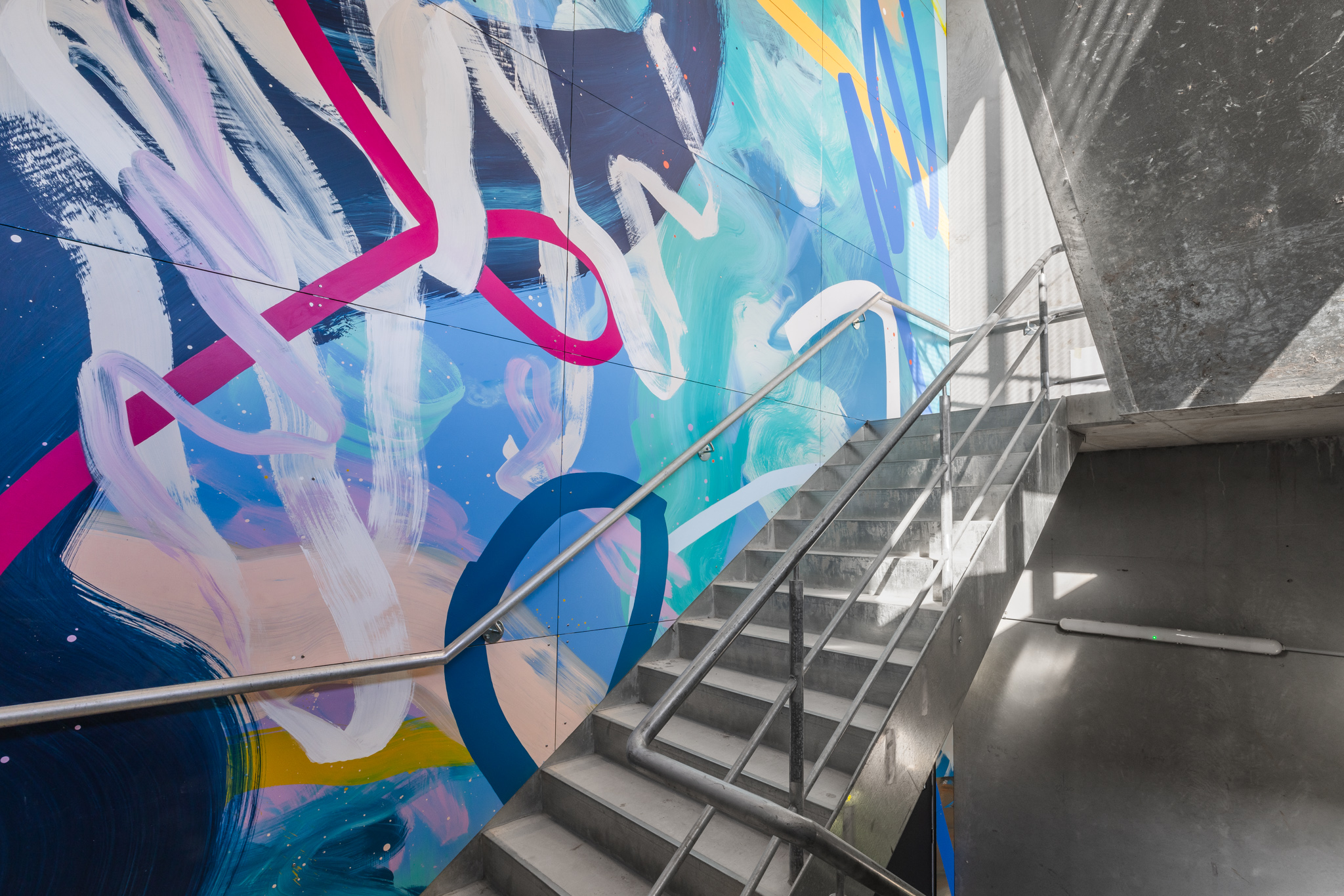

Colour as Environmental Experience
Rather than viewing colour as purely aesthetic, we can treat it as a fundamental part of public space, an environmental experience as much as a visual one. When colour disappears from our surroundings, it results in more than visual monotony. It creates a kind of sensory deprivation, and with that comes a dulled emotional connection to place.
Strategic, colour-led public art reintroduces this vibrancy. It activates awareness, encourages participation, and helps restore our bond to place. Through this lens, colour becomes a language of wellbeing, conservation, and cultural storytelling.
Colour as a Tool for Urban Placemaking
Colourful public art is a key tool in shaping more vibrant, connected spaces. It:
- Creates landmark moments in parks, plazas, laneways and waterfronts, places that feel memorable and magnetic.
- Engages communities through colour-rich events like digital projections and sculptural installations that invite joy and collective participation.
- Supports public, corporate, and digital art strategies that weave environmental storytelling into the everyday.
In this way, colour isn’t just surface-level but a public strategy. It reorients us toward nature, community and feeling.
How to Embrace Colour in Public Art
To champion meaningful colour in public art, we recommend:
- Activating shared spaces with bold, context-sensitive installations.
- Embedding ecological narratives through seasonal palettes, natural cycles, or environmental themes.
- Collaborating with local councils, First-nation artists, and fabricators to ensure work is responsive and relevant.
- Designing for accessibility and interactivity allowing audiences to move through, touch, and even co-create the experience.
When done well, colour in public art becomes a tool for healing, participation, and ecological connection. It pushes back against sameness and invites wonder.


Let’s Reimagine in Full Colour
At Art Pharmacy, we believe colour holds power. In mural art, ephemeral interventions, and large-scale commissions, we see its ability to reawaken public space. As an art consultancy focused on strategy, placemaking, and social impact, we’ll continue to support projects where colour is both seen and felt.
Let’s reimagine the urban environment in full colour.
Article by Francesca Culy